Homekit Infused 5
Content
Addons > Button
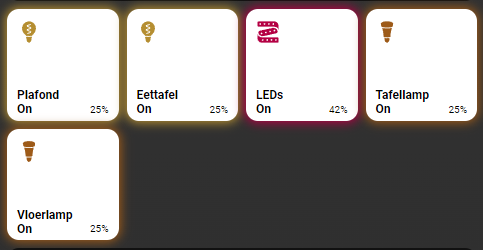
This addon lets you fill your views with very powerful buttons!
HACS Requirements
| Name | Type | Description |
|---|---|---|
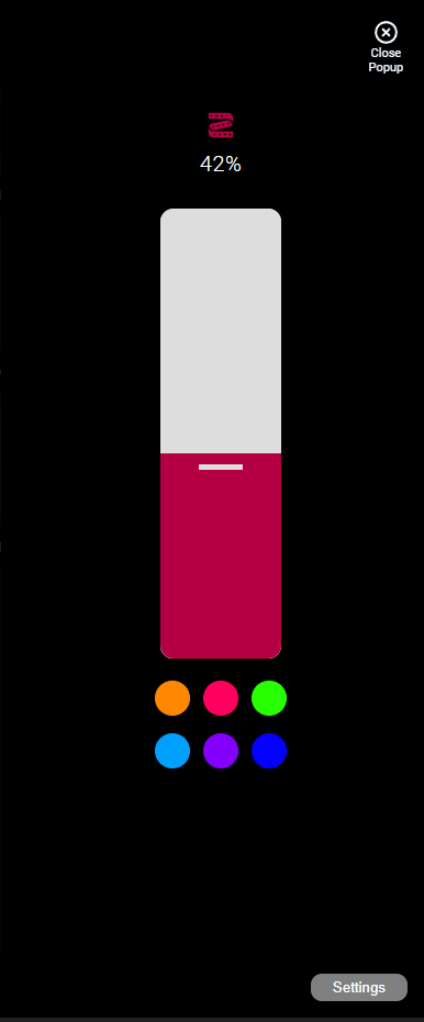
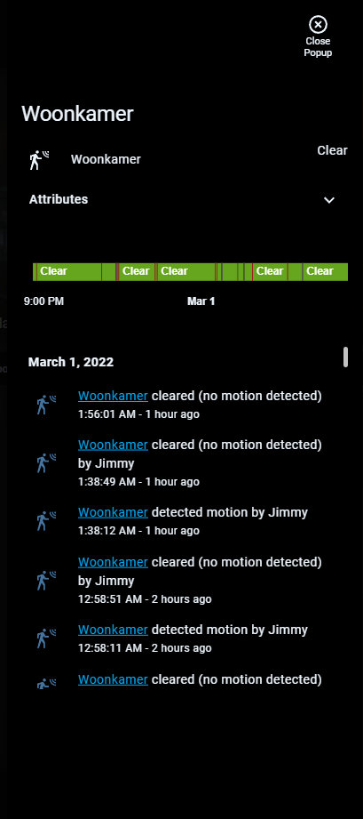
| Light Popup Card | Frontend | This is a popup that opens when holding/double tapping buttons, you need to add this repository MANUALLY in HACS |
| Thermostat Popup Card | Frontend | This is a popup that opens when holding/double tapping buttons, you need to add this repository MANUALLY in HACS |
| Cover Popup Card | Frontend | This is a popup that opens when holding/double tapping buttons, you need to add this repository MANUALLY in HACS |
| More Info Card | Frontend | This is the card that shows a standard HA styled color wheel in conjunction with the light popup card |
| Mini Graph Card | Frontend | Mini Graph Card gives the possibility to create more advanced graphs! |
NOTE: this addon is just a preconfigured custom:button-card template. You can use 99,9% of the options that are available in that card, HKI however has some extra options/configuration that can not be found in that card.
You can use any of the following options to modify your addon.
Stack Config
| Name | Required | Default | Description |
|---|---|---|---|
| title | no | undefined | Set the title of the stack, ommitting this line will or setting title: hide will hide the title |
| columns | no | 3 | Define the number of columns this stack will use |
| square | no | true | Set if the buttons should be square or not, this is only useful when you set individual aspect_ratios in the config below |
| lock | no | false | this locks the entire stack and will now need two taps to turn on/off, the first tap unlocks, the second toggles |
| aspect_ratio | no | 1/1 | Set the aspect ratio of all the buttons in this stack at once |
| view_layout | no | undefined | This is best used in conjunction with the layout addon, but can also be used to control whether to show this stack on different screen sizes. |
| conditional | no | false | Setting this to true will make the stack condtional |
| conditions | no | undefined | Add entities and conditions, this will determine when this addon will be shown, e.g. if entity x is turned on, then show this addon (see addons for examples |
| entities | yes | list of entities | List all your entities you want to show up here |
Button Options
By default you must enter an array of entities like in the examples below, this does not need extra options and will just get the global name/icon. You must define it as an object instead to make use of the options below.
| Name | Required | Default | Description |
|---|---|---|---|
| entity | yes | undefined | Set the entity used |
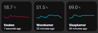
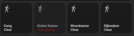
| type | no | auto | This forces a button to be seen by HKI as a specific type, which alters the appearance. Choose between rgb, color-temp, switch, graph, sensor, cover, scene, thermostat or fan. By default HKI tries to figure out itself what kind of type the button is, but if it gets it wrong force it by setting the type |
| name | no | global_name | Set a name for this button, this accepts JS templates |
| label | no | none | Set a label for this button, this accepts JS templates |
| icon | no | global_icon | Set an icon for this button, this accepts JS templates |
| state_display | no | undefined | Override the way the state is displayed, this accepts JS templates |
| entity_picture | no | global_entity_picture | Set an entity picture for this button, note that when an entity_picture is set in either customize.yaml or here, that it will take priority over an icon, unless you set show_entity_picture: false, this accepts JS templates |
| background_image | no | undefined | Set an URL or a /local/* to an image to show as background |
| lock | no | false | this locks this button and will now need two taps to turn on/off, the first tap unlocks, the second toggles |
| aspect_ratio | no | 1/1 | Set a custom aspect_ratio for this button, note that you will want to set square: false in the stacks configuration when setting anything other than 1/1 |
| size | no | 25% | Set the icon size, note that this setting is not always working as expected due to the grid used, play around with it |
| units | no | undefined | Override or define the units to display after the state of the entity. If omitted, it’s using the entity’s units |
| button_badge | no | undefined | Use the HKI predefined badge in your button, you MUST define an entity to use, you can only use it’s state! |
| icon_color_active | no | undefined | Use this to override the icon color when the entity is active, this accepts JS templates |
| icon_color_inactive | no | undefined | Use this to override the default icon color, this accepts JS templates |
| show_name | no | true | Choose to show/hide the name, set to false to hide it |
| show_label | no | true | Choose to show/hide the label, set to false to hide it |
| show_icon | no | true | Choose to show/hide the icon, set to false to hide it |
| show_state | no | true | Choose to show/hide the state, set to false to hide it |
| show_last_changed | no | false | Choose to show/hide the last_changed state, set to true to show it, note that this will replace the label! |
| show_live_stream | no | false | If a camera entity is set, show a live stream instead of still images |
| show_units | no | true | Choose to show/hide the units, set to false to hide it |
| show_entity_picture | no | true | Choose to show/hide the entity_picture, set to false to hide it |
| confirmation | no | undefined | Display a confirmation popup. See official documentation for more information |
| template | no | undefined | By default this button will take on the HKI default style, you can set template: empty to clear it and use your own styles |
| layout | no | undefined | The layout of the button can be modified using this option, you MUST set template: empty for this to work properly. See official documentation for more information |
| triggers_update | no | undefined | entity_id list that would trigger a card update. See official documentation for more information |
| group_expand | no | false | if any of the entities triggering a card update is a group, it will auto-expand the group and the card will update on any child entity state change. This works with nested groups too. See official documentation for more information |
| spin | no | false | Set this to true if you want the icon to spin when the state is on |
| styles | no | predefined | Set your own styles to the button, this is best used with template: empty. See official documentation for more information |
| extra_styles | no | undefined | Set extra styles. See official documentation for more information |
| state | no | predefined | Set custom styles per state, must be an object list! See official documentation for more information |
| custom_fields | no | predefined | Set custom fields with your custom styles. See official documentation for more information |
| tap_action | no | predefined | Set a custom tap_action for your button, by default HKI uses a different action automatically depending on the entity domain. See official documentation for more information |
| hold_action | no | predefined | Set a custom hold_action for your button, by default HKI uses a different action automatically depending on the entity domain. See official documentation for more information |
| double_tap_action | no | predefined | Set a custom double_tap_action for your button, by default HKI uses a different action automatically depending on the entity domain. See official documentation for more information |
# views.yaml (example simple, no extra options)
  living_room:
    addons:
      button:
        - title: Living Room
          columns: 3
          entities:
            - switch.receiver
            - switch.samsung_tv
            - switch.xbox_one
# views.yaml (example simple, multiple stacks)
  living_room:
    addons:
      button:
        - title: Living Room
          square: false
          entities:
            - switch.receiver
            - switch.samsung_tv
            - switch.xbox_one
        - title: Bedroom
          columns: 3
          entities:
            - switch.receiver
            - switch.samsung_tv
            - switch.xbox_one
# views.yaml (example with extra options)
  living_room:
    addons:
      button:
        - title: Living Room
          entities:
            - entity: switch.receiver
              icon: mdi:speakers
              label: My Speaker
            - entity: switch.samsung_tv
              name: TV
            - entity: switch.xbox_one
              lock: true
            - entity: sensor.livingroom_temperature
              type: graph
HKI Specific Button Types Extra Options
Some buttons get some extra options if you set type: graph, type: switch, type: rgb, type: color-temp, type: thermostat and type: cover.
| Name | Required | Default | Description |
|---|---|---|---|
| popup_style | no | auto | When having type: switch, type: rgb or type: color-temp, you can force the popup to be either switch or a slider |
| line_color | no | red | When having type: graph you can set the line_color, this can be a css name or a hex value (e.g. Red or ‘#FF22FF’) |
| graph_type | no | line | When having type: graph you can change the graph_type between bar or line |
| cover_control | no | cover_position | When having type: cover you can set if you want to control the cover_position or tilt_position with the slider |
| action | no | undefined | When having type: thermostat, you can reverse the default tap/hold action behaviour by setting action: alternative |
| ambient_temperature | no | undefined | When having type: thermostat, set this to show the current temperature from a different sensor in your thermostat buttons, this is only an aesthetic change and doesn’t change the functionality of your thermostat! |
| attribute | no | undefined | Only works when having type: thermostat! If your thermostats show undefined as its state you should use the following config attribute: state |
Tips
By default the label is either the brightness of a light or empty, however with button-card JS templates you can have a cool label like this
# views.yaml (example with custom label)
my_view:
addons:
button:
- title: Laundry Room
entities:
- entity: switch.washing_machine
lock: true
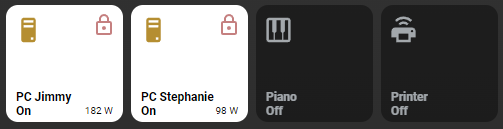
label: "[[[ return `${states['sensor.washing_machine_power'].state} W`; ]]]"
The same is true for icons and you can template an icon to be different for each state:
# views.yaml (example with custom icon)
  my_view:
    addons:
      button:
        - title: Laundry Room
          entities:
            - entity: switch.washing_machine
              icon: "[[[ if (entity.state == 'on') return `mdi:lamp`; else return `mdi:floor-lamp` ]]]"
How to force a HKI type to your entities?
# views.yaml (example with forced types)
  my_view:
    addons:
      button:
        - title: Buttons
          entities:
            - entity: light.bedroom
              type: rgb
            - entity: switch.ventilator
              type: fan
            - entity: climate.bedroom
              type: thermostat
            - entity: sensor.bedroom_temperature
              type: graph
Images: